A lightweight design system for a remote, growing team
Summary
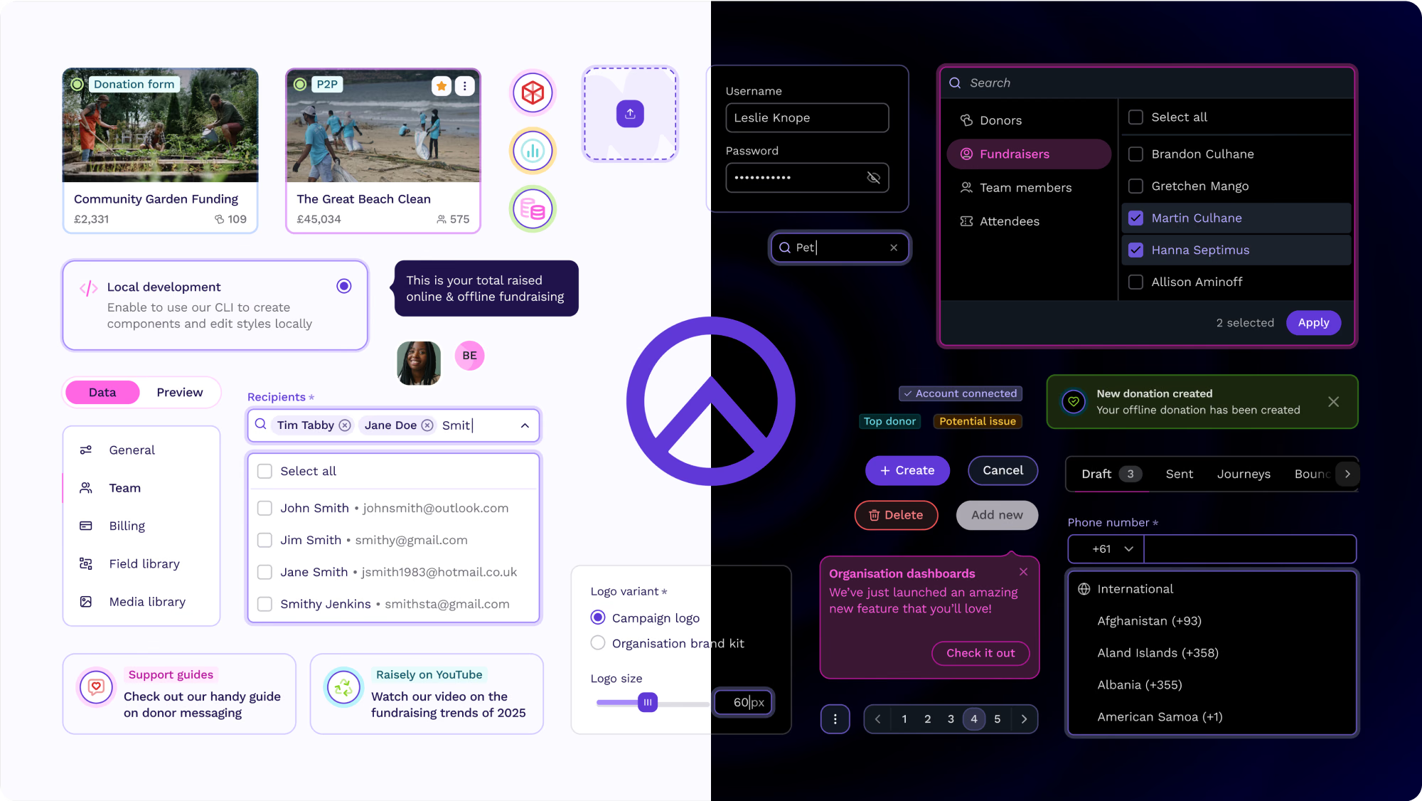
After a rapid growth phase, Raisely’s product had built up considerable design and tech debt. We needed a system to help us craft a more consistent, accessible and stable product with greater confidence and speed – and at the same time, this was also an unique opportunity for us to reimagine what a modern product UI could look like for Raisely.
As one of three Product Designers on the Design System, I worked closely with engineers, other product designers, and leadership: I led the build of the design token architecture, mentored my peers on Figma component building best-practices, collaborated with engineers to define tooling and processes, and wrote documentation for a large part of our design system.
Role
- Product Designer
Status
- Implemented, 2022–25
Team
- 10x Engineers
- 1x Design Lead
- 2x Product Designers
Tools
- Figma
- Token Studio
- Storybook
- Tailwind
Problems
- UI decisions were constantly re-debated.
- Figma and React library inconsistencies slowed down delivery.
- Component library blocked progress instead of enabling it.
- Accessibility issues on both a component and system level.
Solutions
- Rebuilt the system from the inside out.
- Defined tokens, patterns, and rules that map to code.
- Implemented a token system that allowed for accessible colour modes with minimal additional engineering effort.
- Focused on adoption over completeness, and a seamless rollout from a customer perspective.
- Implemented systemic accessibility checks on a component level.
Results
- Implemented for 3 product squads at Raisely, planned to roll-out across two sister companies after acquisition
- Raisely engineers rated the system 4.4/5 for speed and efficiency
- Repeated UI debates dropped, QA friction decreased.
- Increased customer satisfaction score after redesign implementation
Challenges
As a relatively small design and engineering team that built their design system from scratch, our learning curve was steep and we all wore many different hats. I initiated and lead our design team’s transition from Sketch to Figma in 2022, mentored other designers on our team on Figma’s component building best practices, and continuously evolved our system to best serve our engineers.
Together as a team, we developed robust processes both within the design team, as well as between design and engineering. Lead by our engineering team, we switched to a new tech stack, prioritising tools to help us improve the efficiency of our workflows, the scalability of our system, and the accessibility of our product. And we wrote a lot of documentation (so much documentation).
I also built a system of global design tokens, that provided out-of-the-box support for light and dark mode, as well as the potential for future high contrast modes. After Raisely’s acquisition, this system came to eventually support a multi-brand design system with 87 components across multiple products.
Key challenges
- 01
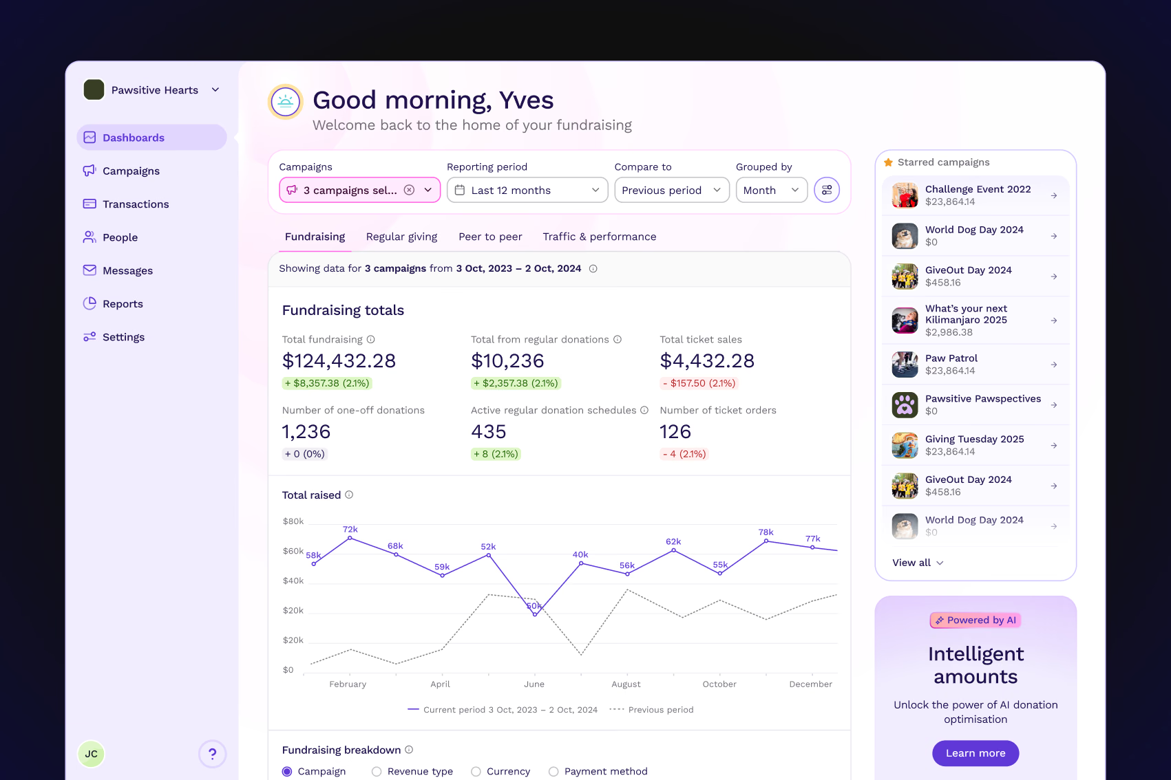
Figma and React libraries were out of sync, misrepresenting what was actually in the code base
- 02
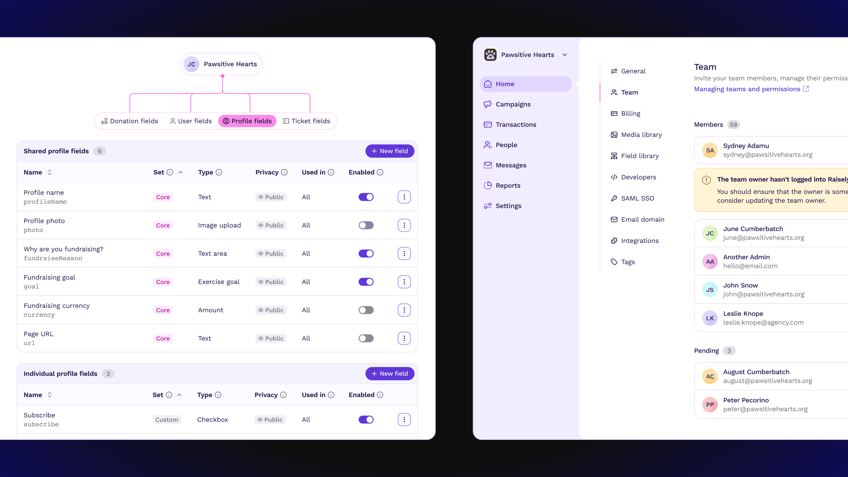
Outdated Figma components lacked auto layout, variants, and usage guidelines
- 03
Components lacked accessibility due to lack of consideration, documentation and testing during component development.
Solution
I led the rebuild of the Figma component library, making sure each component and variant matched the React Storybook. I collaborated closely with engineers to keep design and code aligned, refining structure, naming conventions, and organisation to make the library more intuitive and searchable.
Semantic tokens & Tailwind
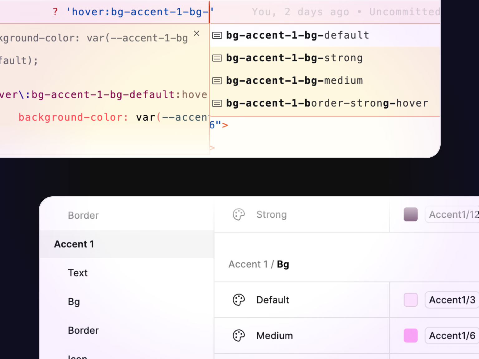
I set up a shared system for managing colors, spacing, type, and other UI values across Figma and code. At the time, Figma Variables didn’t exist, so I used Token Studio to connect our design tokens directly to Tailwind. This kept design and code aligned and gave the design team control over how the system was structured and maintained.
I kept the system simple with two levels of tokens, which gave us enough flexibility to support dark mode, accessible colour modes like high contrast mode, and make future changes without rebuilding components. After Raisely’s acquisition, we added a brand layer that allowed the same system to be used across multiple products while still supporting different brand styles.
Documentation
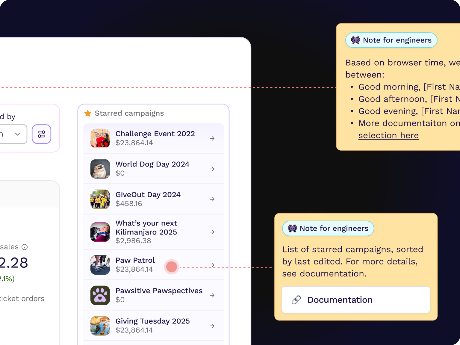
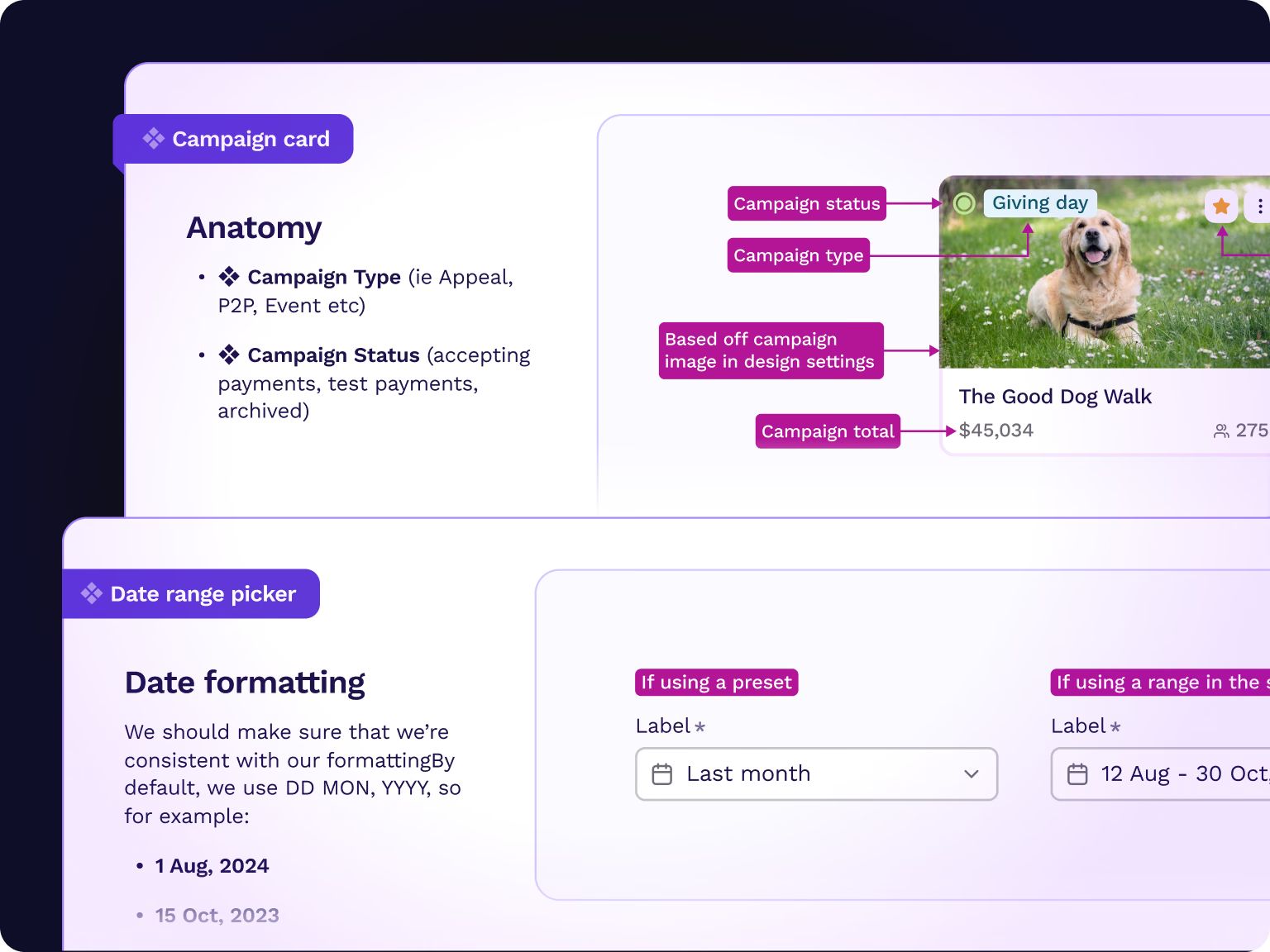
I created a consistent documentation process for new components, covering what they were for, how they were structured, their different states, and how they behaved across screen sizes and interactions. This gave designers a clear reference when using or reviewing components, and gave engineers the detail they needed to build them correctly.
For handoff, we introduced a Handoff Helper component to capture additional context and implementation details directly in Figma. This was particularly useful for our remote team, where we couldn’t always jump on a call to work through questions. Keeping decisions and discussions in the file made the work easier to follow and reduced unnecessary back-and-forth.
Outcomes
Designed to move faster
The new design system gave Raisely a more consistent foundation for designing and building products, bringing Figma and code closer together and making components easier to reuse and maintain. Clearer documentation and handoff reduced back-and-forth between design and engineering, while the token structure gave us a flexible foundation that could scale across products and brands after the acquisition.
Other work
- 2025–26AI-native analytics for non-technical teamsFilament
- 2023Helping charities raise more moneyRaisely
- An integrated ticketing experience for nonprofit eventsRaisely
- 2023Converting one-time donors to recurring supportersRaisely